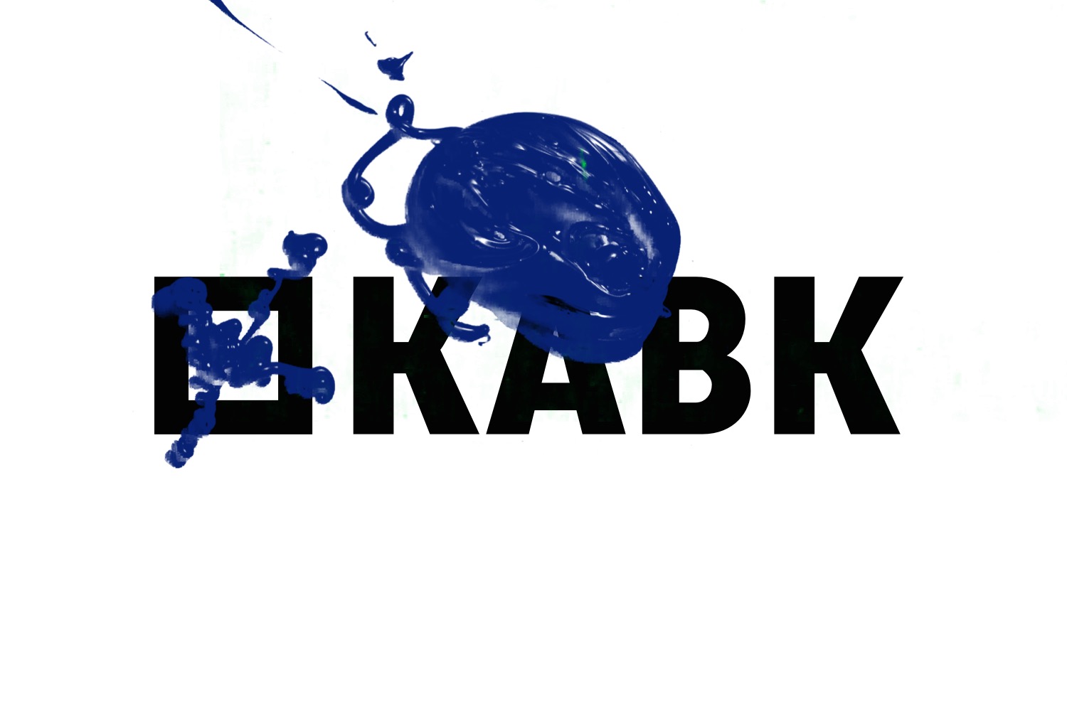
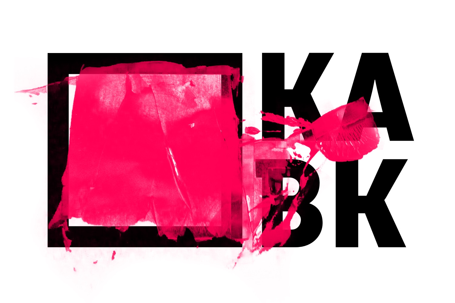
Underground branding for the KABK
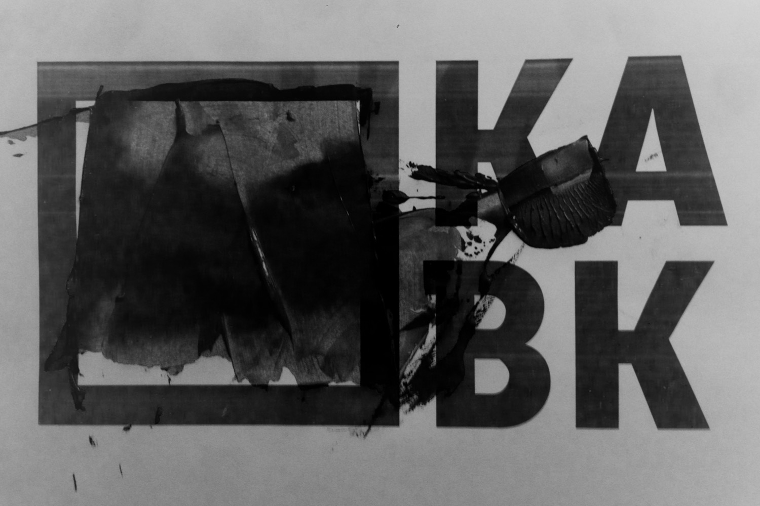
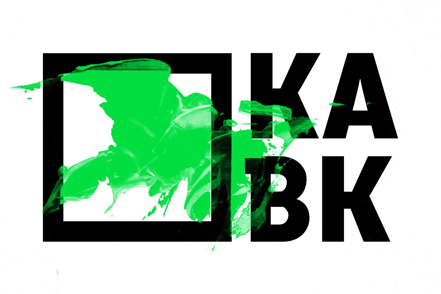
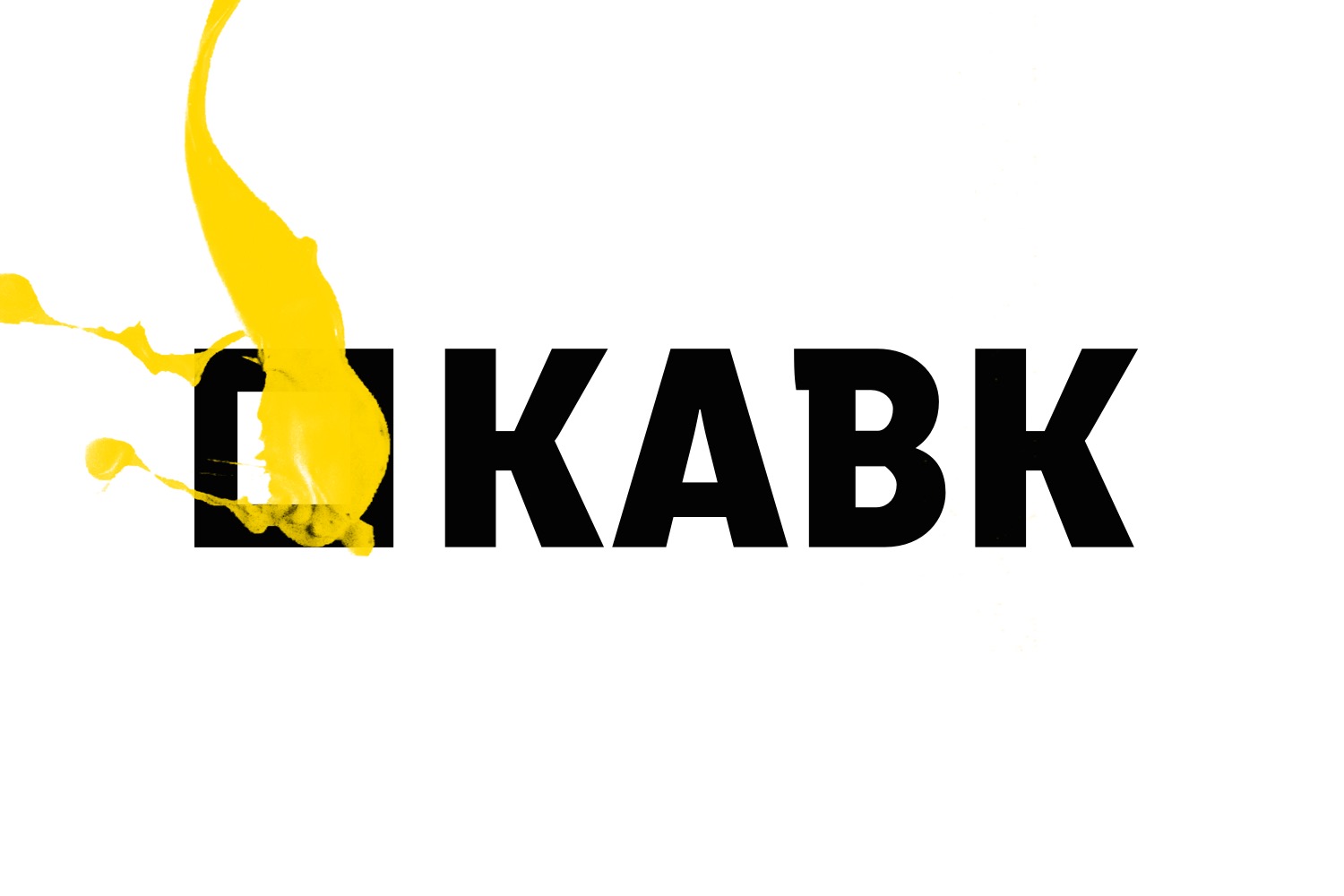
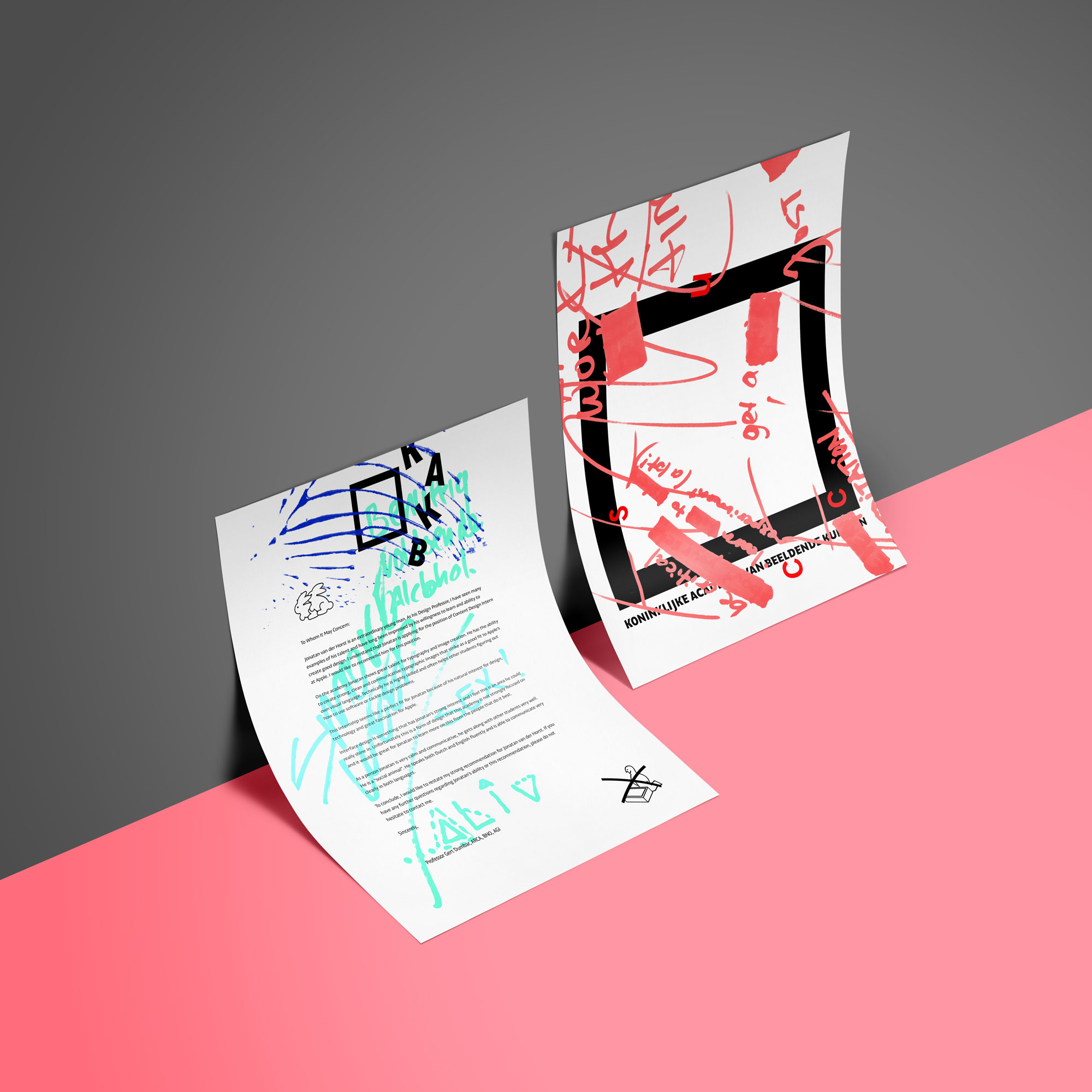
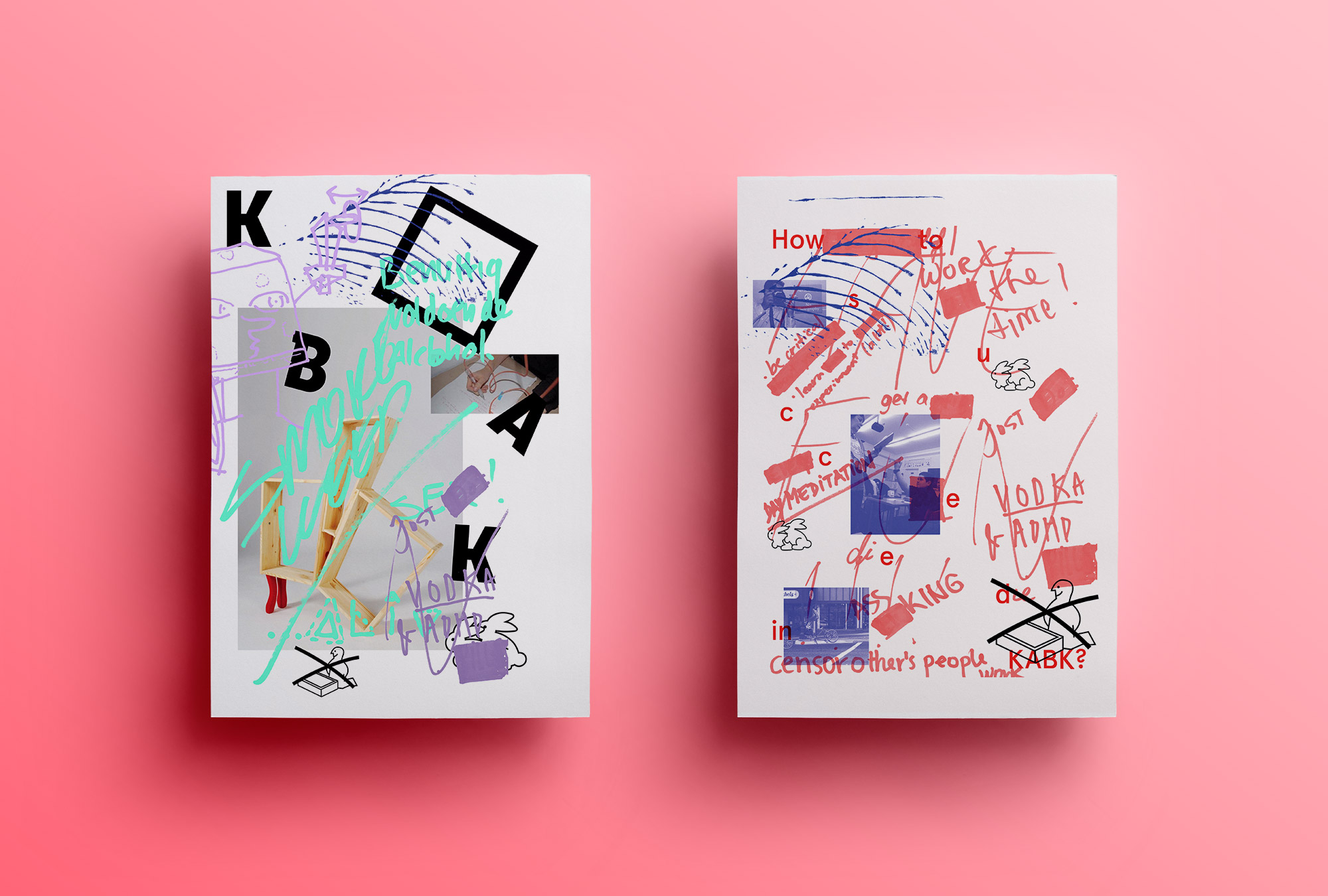
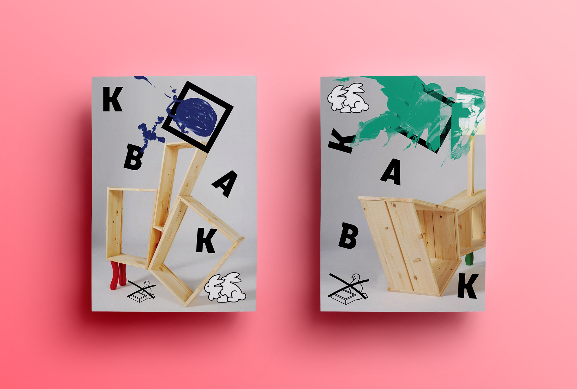
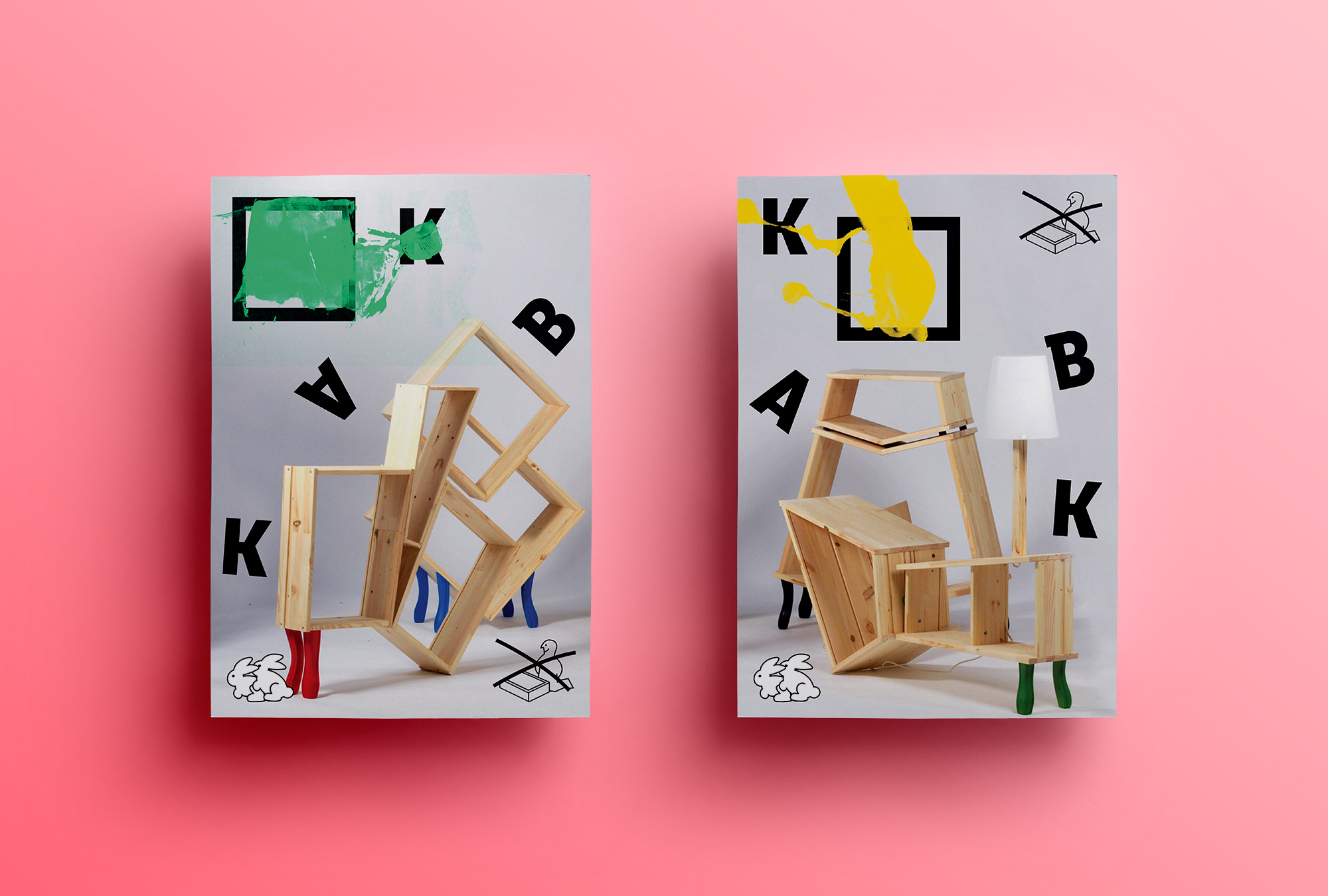
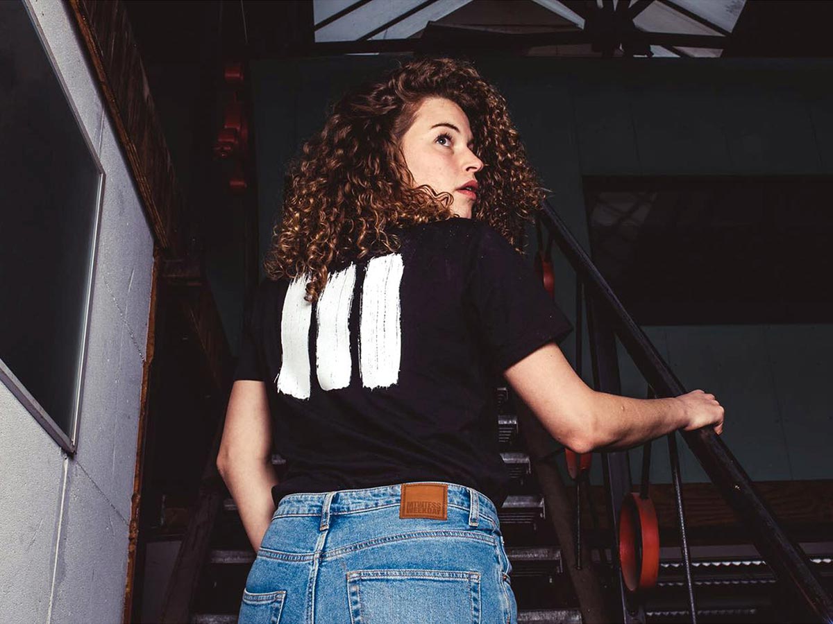
While studying at the Royal Academy of arts in The Hague I made a visual identity that represented the academy experience from the students point of view. Throughout the shool I hang posters asking art students what they think it takes to survive the adacemy. After collecting all input I made the drawings and quotes into elements to be used in the visual language like icons and graphic elements and some into the concept for photography. The logo is meant to be a blank square/canvas filled by something students have made. Making this identity very dynamic.
While studying at the Royal Academy of arts in The Hague I made a visual identity that represented the academy experience from the students point of view. Throughout the shool I hang posters asking art students what they think it takes to survive the adacemy. After collecting all input I made the drawings and quotes into elements to be used in the visual language like icons and graphic elements and some into the concept for photography. The logo is meant to be a blank square/canvas filled by something students have made. Making this identity very dynamic.
Art direction, visual identity
2013
Unikea project © by Kenyon Yeh
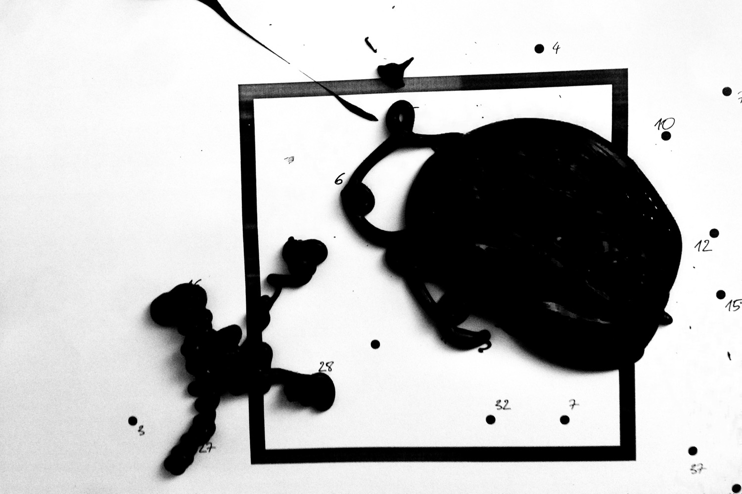
"How do you survive the Royal Academy of Arts?"
I wanted to make this identity useful for students. So I gave them some advises from fellow students. After hanging some empty posters in the academy building they were quickly filled with tips on how to do great at art school. I'll let the results speak for themselves:
The new square logo represents a blank canvas as a proxy for the fresh minds of new students. Artistic freedom is an important part of this logo concept. The logo can be filled with any element from the identity and can be customized for any specific usecase.
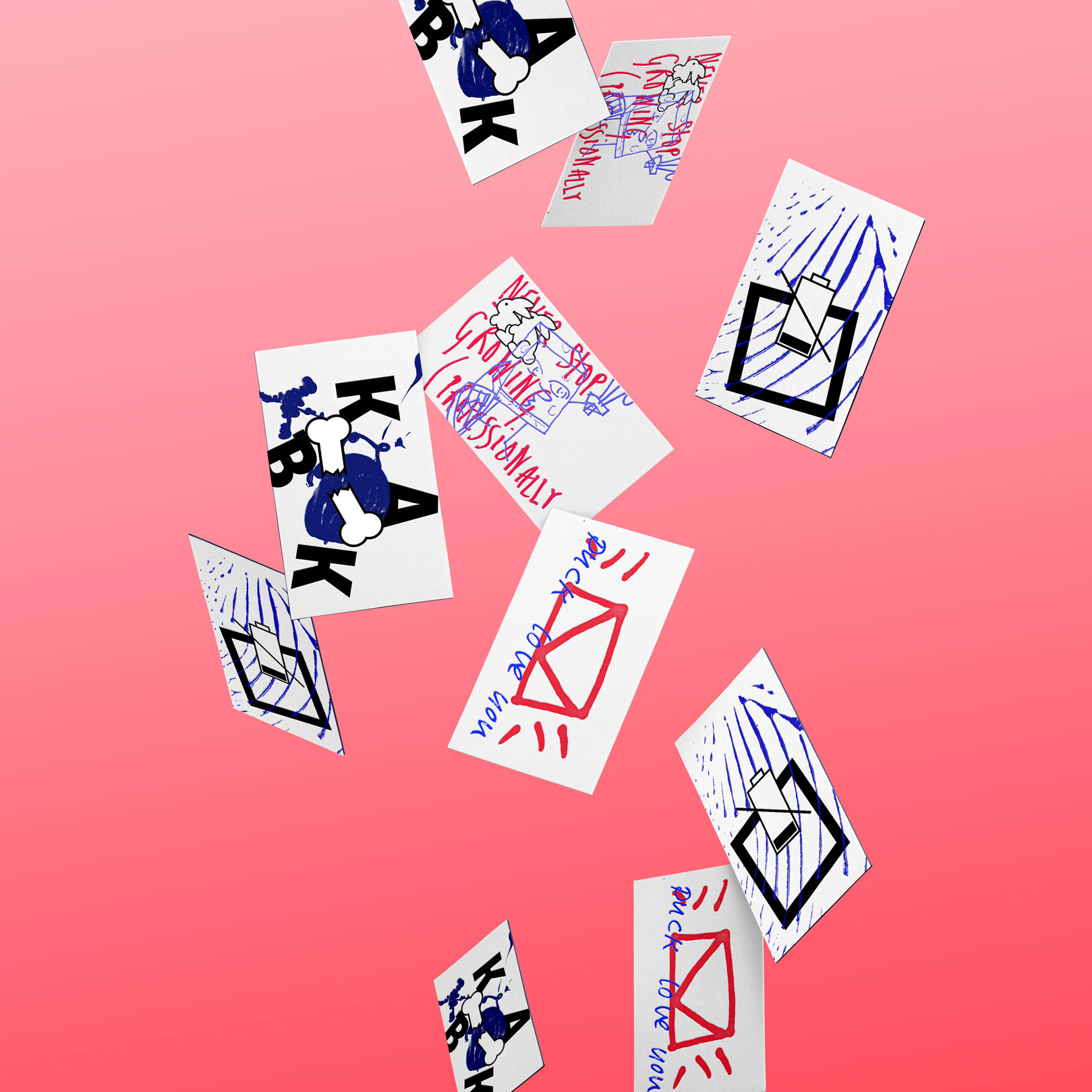
From concept to production
We had a lot of fun creating logo variations. The idea is that other designers will create their own versions of the logo in the future.
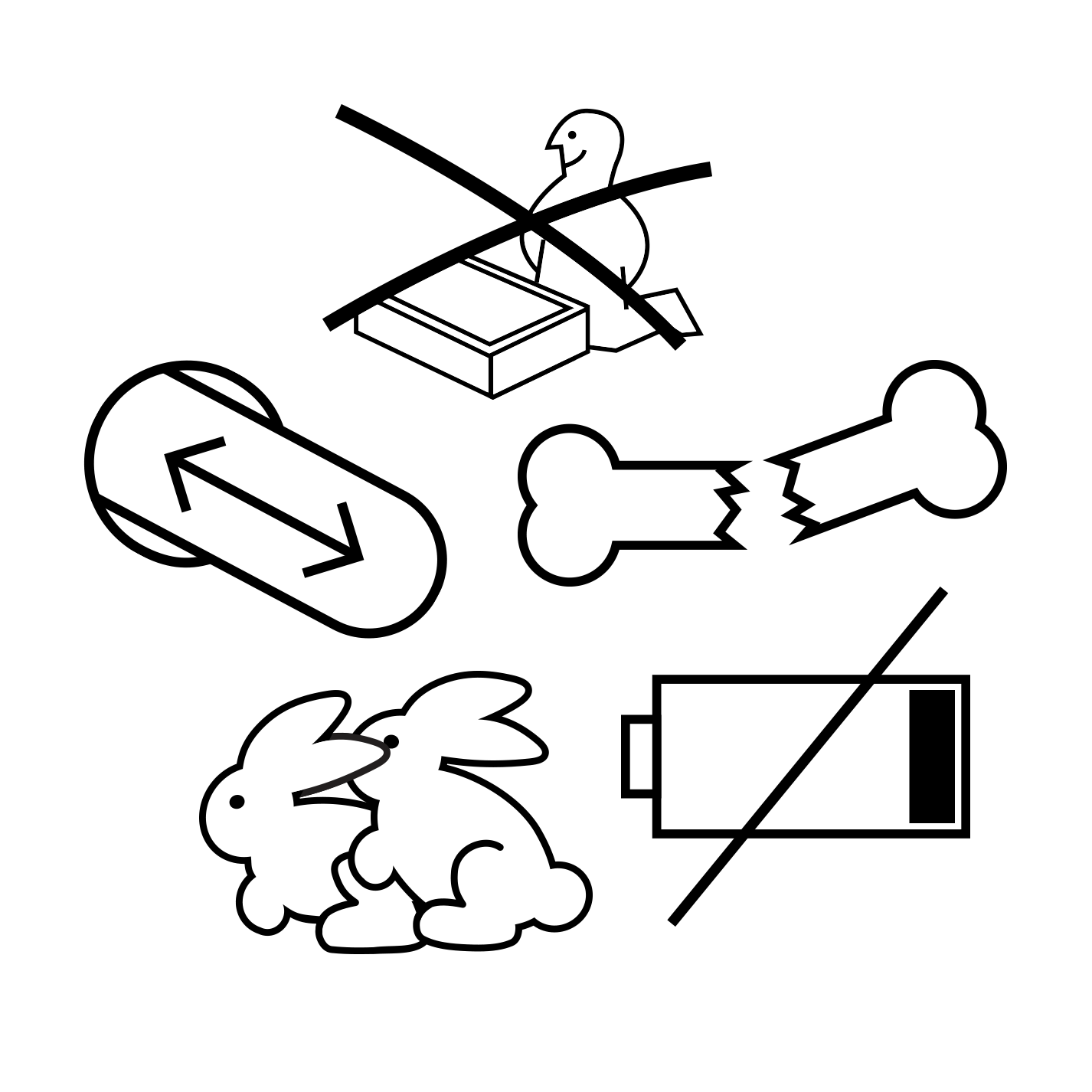
An ever expanding set of branding elements
This school is different for everybody and definitely does not let itself be ecapsulated in one corperate identity, it needs to be alive. Most people attending this academy do not fit the grid and the institute is definitely not royal in any sense of the word. People fail constantly and that's what makes it work.
I have a vision for this identity. Making it owned and controled by students, making sure they add their own elements to the system, expanding in size and diversity. This icon set was made to add to it's visual diversity, more chaos less grid.
That's it! Check out these other cases:
Tony CliftonVeni, Vidi, Fuck the World!

Purify the webThe Autarky content blocker

Mobility ServiceLeasing for the 21st century
De Giro on the goRewriting De Giro's mobile story
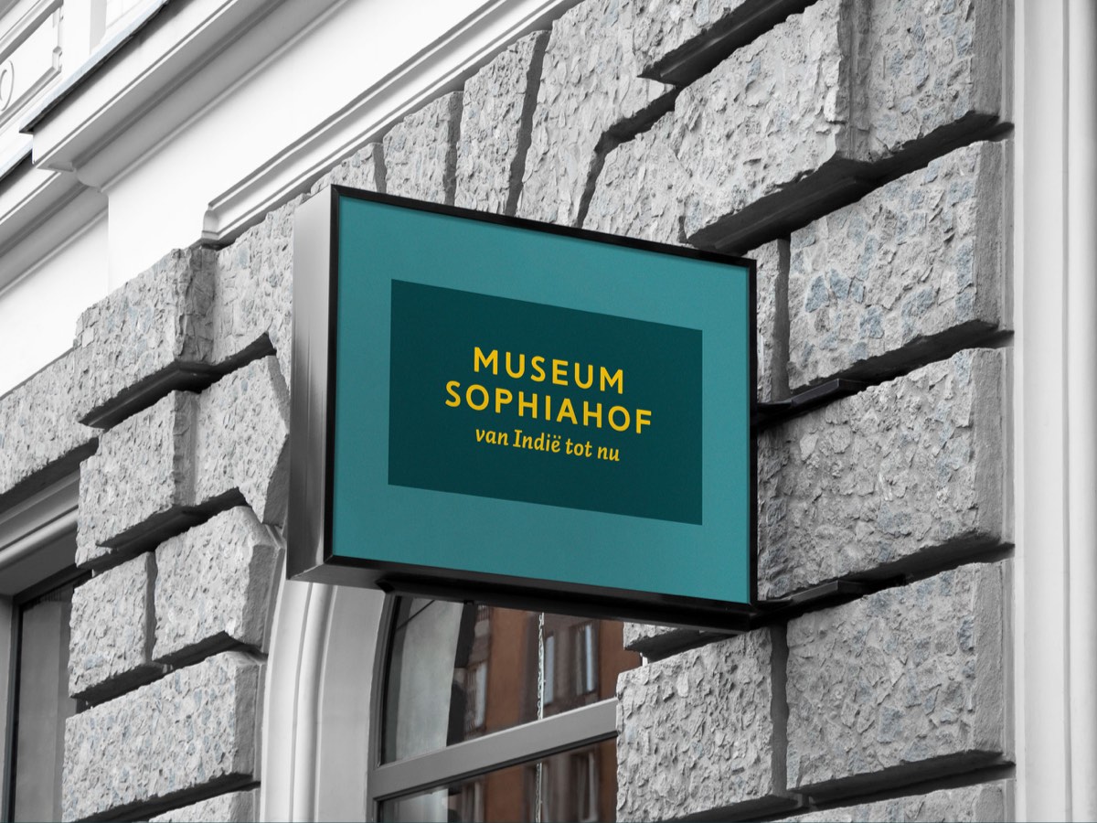
From then till nowThe visual identity for Museum Sophiahof
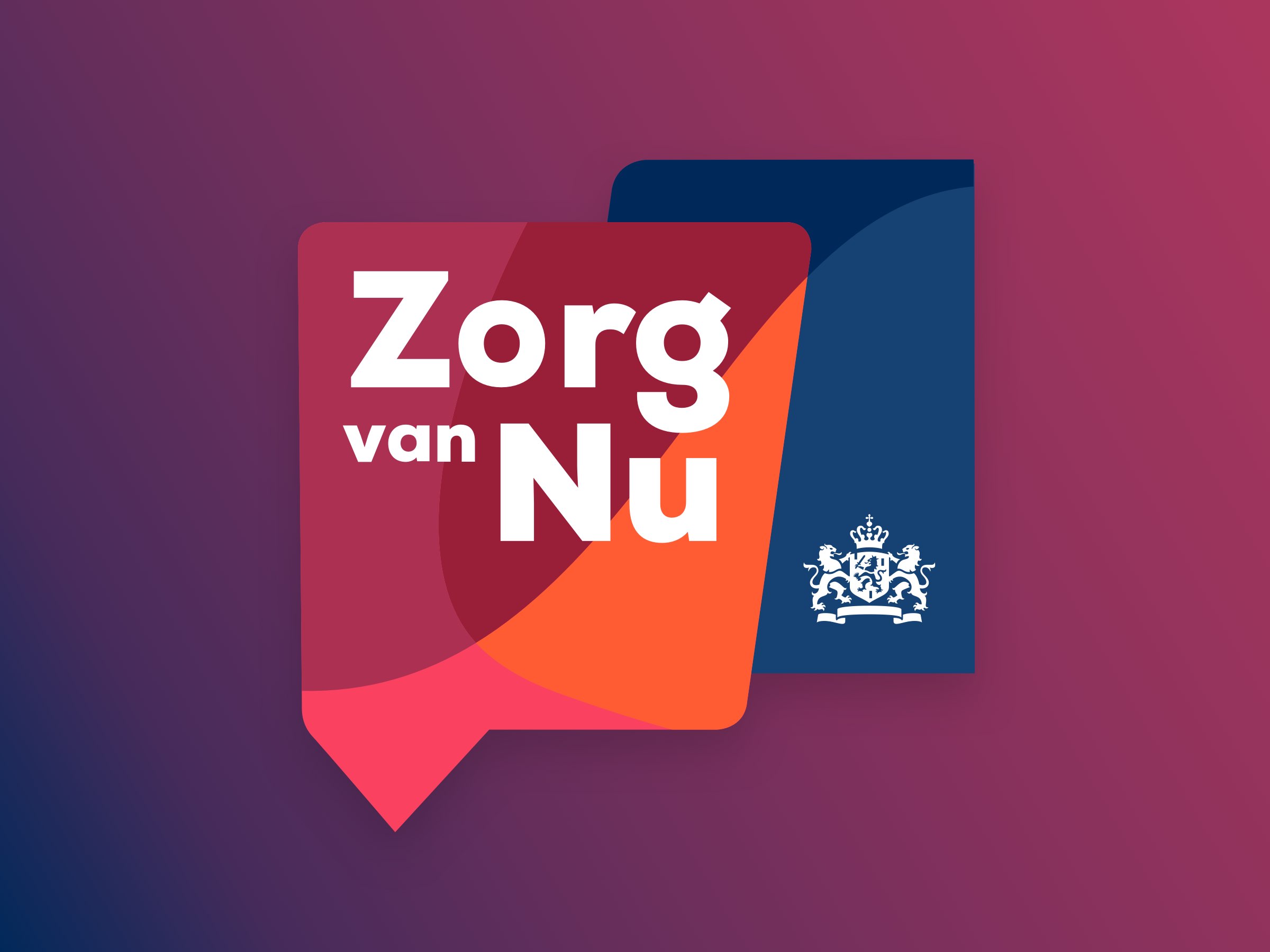
Zorg van NuGetting smart Healthcare solutions to the right people
Elsewhere
Instagram
LinkedIn
Dribbble
Address
Eva Besnyöstraat 278
1087 LM Amsterdam
Address
Nova Zemblastraat 489 B
1013 RJ Amsterdam
Address
Nova Zemblastraat 489 B
1013 RJ Amsterdam
KVK
74164287
Volkoren is a design agency. We design strategy, pixels and print. ©Volkoren, 2024
Volkoren is a design agency. We design strategy, pixels and print. ©Volkoren, 2021
Volkoren is a design agency. We design strategy, pixels and print. ©Volkoren, 2021